In recent years, dark mode has become a rising trend in UI/UX design, challenging the traditional light mode dominance. Popular apps, websites, and even operating systems now offer users the option to toggle between both modes. But as a website owner or designer, you’re faced with a critical decision: Should your website default to dark mode, light mode, or offer both?
Let’s dive into the pros, cons, and considerations to help you decide which is better for your website.
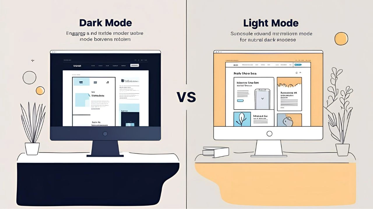
What is Dark Mode and Light Mode?
- Dark Mode: Features a dark background with light text. Often considered easier on the eyes in low-light environments.
- Light Mode: The traditional design choice with a white or light background and dark text. It offers a cleaner and brighter appearance.
Pros and Cons of Light Mode
✅ Advantages:
- Familiarity: Most users are accustomed to light mode from traditional websites and printed materials.
- Better in Bright Environments: Easier to read in daylight or well-lit rooms.
- Professional Look: Offers a clean, minimalistic appearance ideal for professional and corporate websites.
❌ Disadvantages:
- Eye Strain at Night: Can be harsh on the eyes in dark environments.
- Battery Usage: On OLED screens, light backgrounds consume more battery than dark ones.
Pros and Cons of Dark Mode
✅ Advantages:
- Eye Comfort at Night: Reduces glare and blue light, making it easier on the eyes during night-time browsing.
- Battery Efficiency: On OLED and AMOLED screens, dark pixels consume less power.
- Trendy & Modern: Appeals to tech-savvy users and gives a sleek, modern look.
❌ Disadvantages:
- Legibility Issues: Not all color combinations work well in dark mode, which can affect readability.
- Content Visibility: Images, infographics, and certain visuals may lose impact on a dark background.
- Not Always Ideal for Long Reads: Some users report more eye strain when reading long paragraphs in dark mode.
User Preferences: What Do People Want?
Studies suggest that user preference depends on context and personal habits. For instance:
- Developers and designers often prefer dark mode during night coding sessions.
- General consumers might lean toward light mode for reading blogs or shopping online.
To accommodate diverse preferences, many websites now offer a toggle switch allowing users to choose their preferred mode.
Accessibility Considerations
When choosing a default mode, accessibility should be a top priority:
- Ensure high contrast between text and background.
- Avoid using pure black (#000000) and pure white (#FFFFFF) – they cause more strain than off-black and off-white shades.
- Test your site with tools like WCAG contrast checker to ensure readability for all users.
SEO & Performance Impact
From an SEO perspective, mode selection doesn’t directly affect rankings, but user experience does. If users find your site comfortable to browse and stay longer, it can improve metrics like bounce rate and session duration – indirectly helping SEO.
Also, well-optimized dark or light modes can contribute to faster load times and better performance on various devices.
Should You Offer Both?
Offering a dark/light mode switch is ideal. It gives users control and can enhance engagement and satisfaction.
To implement both:
- Use CSS custom properties for easy theme switching.
- Store user preference using local storage or system settings (e.g.,
prefers-color-schemein CSS).
Final Verdict: Which is Better?
There’s no one-size-fits-all answer. Here’s a quick summary:
| Criteria | Light Mode | Dark Mode |
|---|---|---|
| Readability | Better in daylight | Better at night |
| Battery Efficiency | Lower | Higher (on OLED) |
| Trendiness | Classic | Modern & Sleek |
| Accessibility | Easier to optimize | Requires careful design |
| User Preference | Widely accepted | Growing popularity |
Conclusion
When deciding between dark mode and light mode for your website, focus on your audience, content type, and brand identity. If possible, implement both modes and let users decide — the extra effort can lead to a better user experience and improved engagement.